
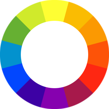
The colour wheel is set up so that opposing colours are complimentary to each other. Colours, when used harshly, can indicate extreme temperatures.
In the screenshot of FarCry (CryTek), the colour palette is very vibrant and fresh. It contains a lot of greens, blues and yellows to portray the beauty of the secluded pacific island . . .

Compare this to a screenshot from Gears of War (Epic Games) . . .

The colour palette empahasises a lot of greys for a very different feel. Both games have, in my opinion, colour palettes used to great effect to portray the overall moods and emotions within their levels. This is something that I should regard highly when creating my custom Half-Life 2 level.
No comments:
Post a Comment