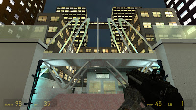
FMPA2 is probably the most thorough project that I have ever worked on. It is also a project of which I have created some of my strongest work to date. The long length of the project allowed me to spend a lot of time on my Half-Life 2 custom game level entitled Light Pollution. I feel that I have made good use of the given time and produced good results despite being a bit ambitious at times.
I was very pleased to receive good feedback from people who play-tested my game level. The good comments that I received have made me really believe that I can take talents to the next level and create triple A, commercial game quality levels. Having a play-test session was a terrific idea, even though it took place on the final possible day. It was very encouraging to see people playing and most importantly enjoying my work. That has to be one of the most rewarding paybacks from all the effort of creating a playable single player experience.
In the early stages of FMPA2, I decided to participate in the Bishop’s Art Prize 2010. A new competition at the university that is judged by the Bishop of Norwich. For the prize I decided to focus on creating a new game concept whilst sticking to the competition theme. I produced concept artwork and a promotional trailer. I am glad that I decided to engage with this opportunity as it gave me something different to work on from time to time. It was more work to do in total but I am glad that I now have this work for my portfolio.
If I had the opportunity to work on this project again from the beginning there are lots of things I would have changed. For example, I would have tried to get more involved with 3D modelling and create 3D props for my level as opposed to creating them inside the Half-Life 2 game editor (Hammer) which takes up a lot more memory. I would have been more decisive when placing the level’s geometry and it would have been a good idea to plan out the level on paper down to even the most intricate of details. This on-paper planning approach may have saved me a lot of time and headaches during the stages of implementing my level’s basic geometry.
A particular feature of my project that I have managed to pull off with style was the lighting throughout the level. During FMPA1 I carried out a lot of research into lighting in game levels, colour theory and colour temperature. The lighting looks most spectacular within the outside locations of the level. The tall background buildings are illuminated by bright spot lights and the bridge is illuminated by yellow and cyan lights which contrast superbly against the dark blue night sky. I feel that I have also done well with the placement of enemies and items within the level and I would like to think that I have managed to achieve a decent difficulty curve.
On completion of the project, I feel a lot more confident in my ability to design first-person shooter game levels. This is a skill that I would love to develop further and I believe that I have the talent to pursue a career in game level design. Using the experience that I have gained from FMPA2, I believe that my future projects will progress a lot better and hopefully achieve progressively more impressive results. I am glad I pushed myself to be ambitious with both FMPA1 and FMPA2 because I have learnt so much many skills that would be useful to any employer within the games industry. My aim at the start was create a playable single player experience that would be challenging, fun to play and visually strong. I feel that I have achieved this and from achieving this, I now have the confidence to raise my standards even higher when working on commercial projects that I may hopefully have the pleasure of working on after completion of my BA (Hons) Games Art and Design at Norwich University College of the Arts.


